Profiling & Optimizing the runtime performance with the DevTools Performance tab
 Photo by Alexander Andrews
A couple of weeks ago I was developing a new authentication feature for the FindHotel website and after finishing the implementation, I started testing the changes.
One thing that I noticed was how laggy the scrolling experience was and how much I should wait until I was able to click elements of the page and receive feedback. The page's interactivity was slow and jank. So I started investigating this problem. And I knew it was a "performance" problem.
To have a good comprehension of this problem, let's start with how the browsers work.
Browsers & the Rendering Process
It won't be a complete, exhaustive description of how browsers work but my thought is to give an idea about the rendering process and talk a bit about some moving parts of this process.
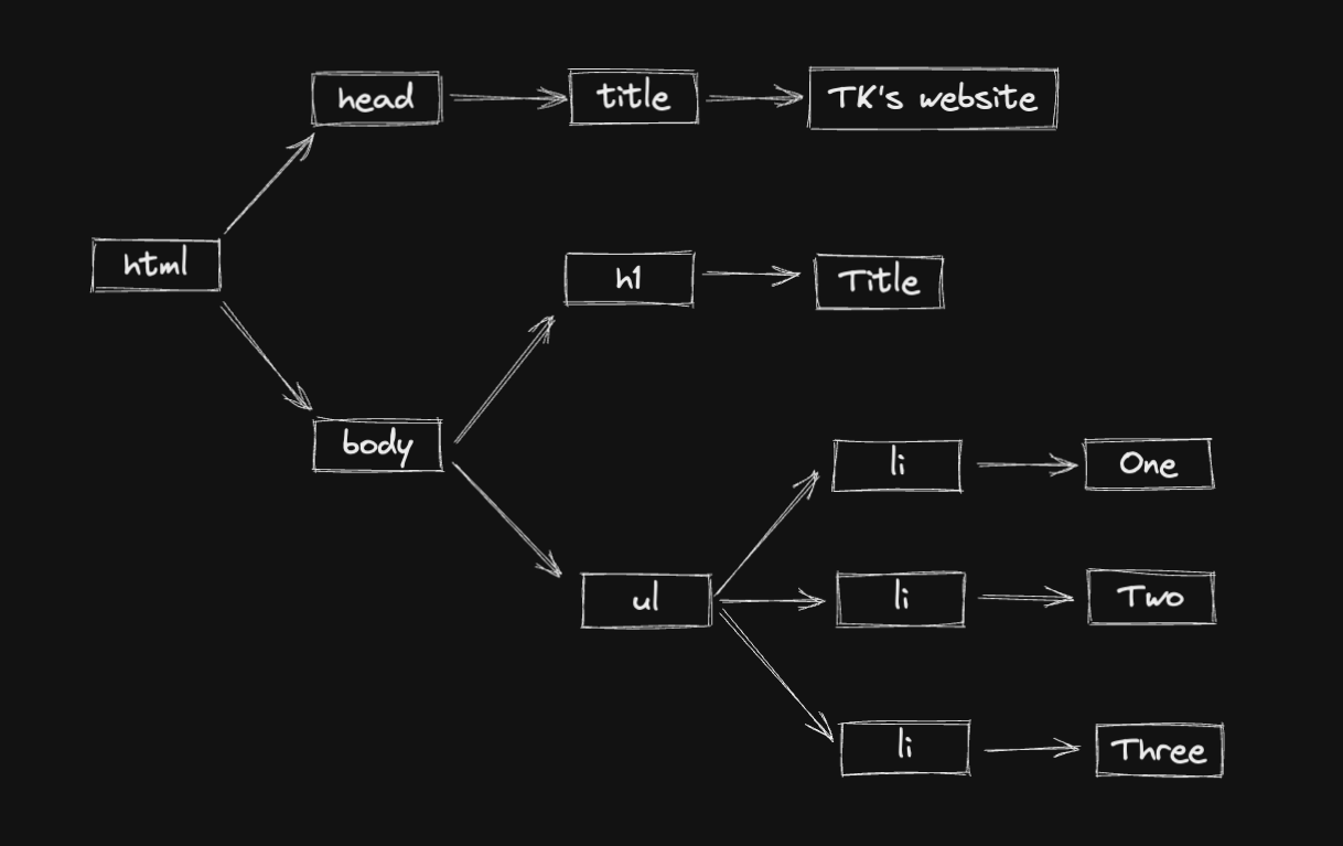
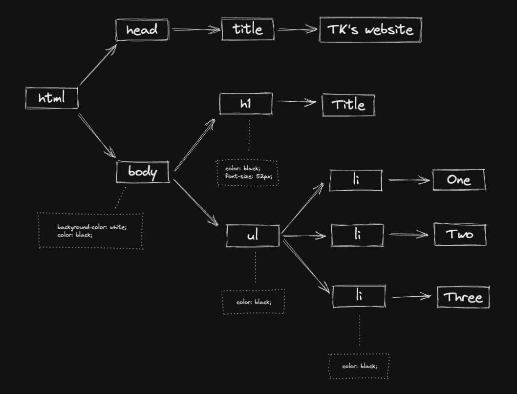
The first two steps are about building the DOM and the CSSOM. The HTML document is downloaded from the server and parsed into the DOM (Document Object Model).
And the CSS sources are also downloaded and parsed into the CSSOM (CSS Object Model).
Together, they are combined into a rendering tree. This tree contains only the nodes required to render the page.
The Layout is a big part of this process. It computes the size and position of each object. Layout is also called Reflow in some browsers.
And finally, the render tree is ready to be “painted". It renders the pixels to the screen and the result is displayed in the browser.
Gecko, the engine used by Mozilla Firefox has a pretty interesting video about how Reflow works
Reflows are extremely computationally expensive in terms of performance and can cause render speeds to slow down significantly. This is why DOM manipulation (inserting, deleting, updating the DOM) has a high cost as it causes the browser to reflow.
A quick crash course on profiling with DevTools
From this foundation, let's now start going in-depth into the problem. In my experience, I could see the UI was sluggish and the pixels were slow to render and there was a white block (when the pixels were not rendered yet) when scrolling the page.
It could be a variety set of reasons the page had this problem. But without measuring the performance, I couldn't really know. Let's start profiling the page.
With the DevTools, I was able to have an overview of the UI using the Performance Monitor.
Here I have access to a set of different attributes:
- The CPU usage
- JS heap size
- DOM nodes
- JS event listeners
And other attributes I didn't add to the performance monitor.
Interacting with the page and seeing these attributes change was the first thing I did to have a better understanding of what was happening there.
The DOM nodes were big but the attribute that caught my attention was the CPU usage. When scrolling the page down and up, the % of the CPU usage was always 100% or around it. Now I needed to understand why the CPU was always busy.
The Chrome devtools is a nice tool to investigate possible performance issues.
We can use CPU throttling to simulate how a user in a slower device would experience the website. In the video, I set this up to slowdown 4x.
The Performance tab is powerful and overwhelming at the same time because it has a lot of functionality and it's easy to lose yourself in so much information in just one tab.
For now, we will focus on two things: the frames and the Main Thread.
In the video, you can see I was hovering the frames and it shows the actions and interactions that were recorded. In the Main Thread, you can see the flame graph, a bunch of tasks that were executed. With both information, we can match the frames with the tasks that took more time to be computed.
With that in mind, a new concept comes up: Long Tasks.
A Long Task is “any uninterrupted period where the main UI thread is busy for 50 ms or longer". As we all know, JavaScript is single threaded and every time the main thread is busy, we are blocking any user interactions leading to a very bad user experience.
We can go deep into each Long Task and see all related tasks it’s computing. With the flame chart, it's easier to understand parts of the application that are causing the long tasks or in many cases, what are the group of actions and components that are causing the performance issue.
Another interesting piece of information from the DevTools is the Bottom-Up tab.
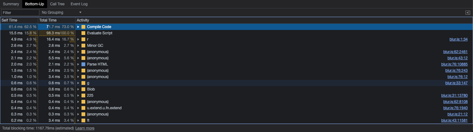
We can click the Long Task and see a bunch of information about the activities in the task. It's a bit different from the flame chart because you can sort the activities based on the cost (Total Time) and also filter the activities related to your application code because it shows other information like cost of garbage collector, time to compile code and evaluate the script, and so on.
It's powerful to investigate the tasks using the flame chart together with the information in the Bottom-Up tab. If you are using React, it's easier to find things like performSyncWorkOnRoot and performUnitOfWork, that's probably related to how React renders and re-renders its components. If you are using Redux, you'll probably see things like dispatch and it requesting React to update some components.
Profiling the Search page with the DevTools Performance tab
Profiling the page's performance I was working on, I found the long tasks and tried to match these tasks with the frames (components that were rendering/re-rendering).
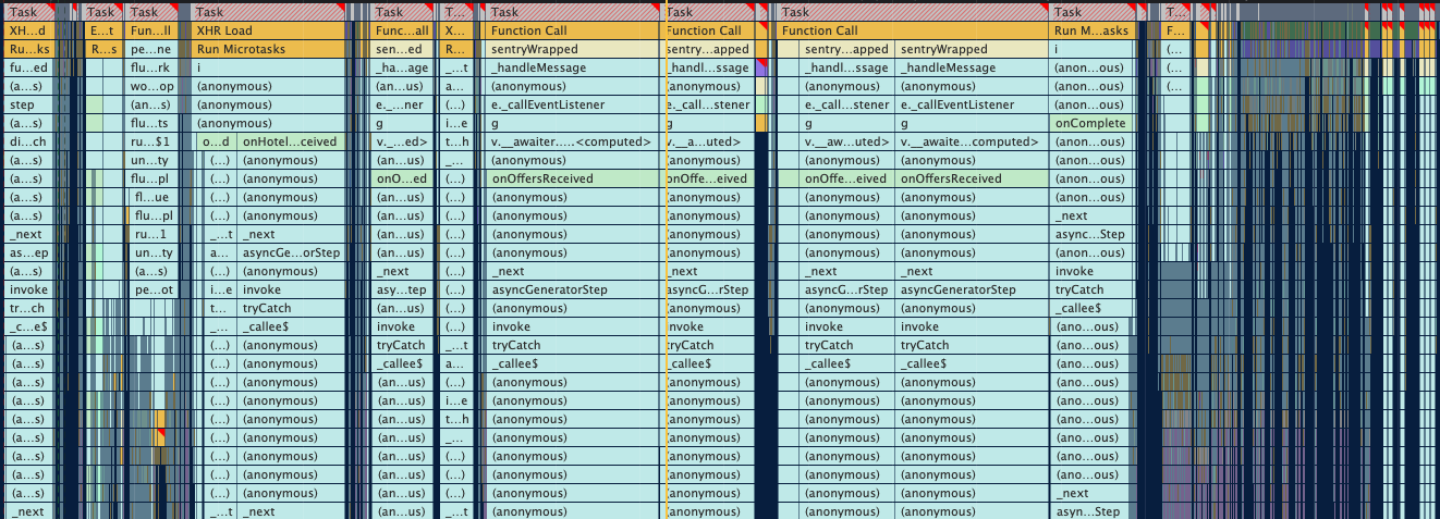
In the Main Thread, I could see a lot of Long Tasks. Not only the number of Long Tasks was a problem, but also the cost of each task. An important part of the whole process of profiling is to find the portion of your codebase in the long task flame chart. At first sight, I could see things like onOffersReceived, onComplete, and onHotelReceived which are callback actions after fetching data through an API.
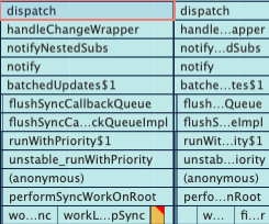
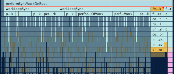
I dug deeper into one of the Long Tasks and I could see Redux dispatching an action and React "performing units of work" (aka re-rendering the components that use the Redux state).
The whole workflow of this page looks like this:
- The page performs an API request: requesting offers, hotels, and other data
- With the API response, we dispatch a Redux action to update the state in the store
- All components that use this updated state will be re-rendered
Dispatching actions and re-rendering components cause the most expensive Long Tasks.
And it's not a single component we're talking about. As this page has a list of hotels and offers, whenever the state changes, A LOT of components will be re-rendered. In the flame chart is possible to see the most expensive components when it comes to re-rendering.
List virtualization: runtime optimizations
Now that we know that reflow, repaint, and DOM manipulation like adding and updating elements in the DOM have a meaningful cost, some solutions to this problem come to mind: reduce the components re-rendering and reduce the elements in the DOM.
One common pattern for lists is to use List Virtualization.
With List virtualization, only a small subset of the list will be rendered in the DOM. When the user scrolls down, the list virtualization will remove and recycle the first items and replace them with newer and subsequent items in the list.
In the video, you can see the DOM being updated. It renders only 3 elements in the DOM and when the user starts scrolling, it will recycle and replace the first items with the subsequent items in the list. We can see the data-index changing. It starts with a 0 index and renders only 0, 1, and 2 at first. Then 0 becomes 1, 1 becomes 2, and finally, 3 is the new element rendered in the DOM.
We have a set of nice windowing libraries that do this job very well for us. I considered react-window, but in the end, I chose react-virtuoso to test and analyze the results.
Recording both the current approach we use to render the list and the solution with list virtualization, I could see improvements in the latter.
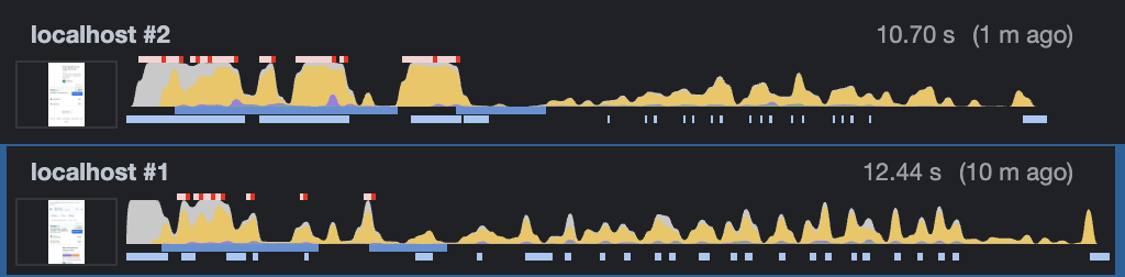
localhost #2 — current search page without list virtualization: more long tasks, long tasks costing more, more CPU usage, and laggy scrolling experience
localhost #1 — with list virtualization: fewer long tasks, long tasks costing less, less CPU usage, and a more smooth scrolling experience
Examples of long tasks on this page are the onOffersReceived and onComplete. They cost around 400ms and 300ms respectively in the current version. With list virtualization, the cost decreased to around 70ms and 120ms respectively.
In summary, with list virtualization, we rendered fewer elements in the DOM, less components are re-rendered, this reduces the number of long tasks and the cost of each task, which provides a silky smooth rendering experience.
Other benefits include faster user interactivity (Time To Interactive), fewer images downloaded in the first render, and scalability when it comes to the list pagination.
- Faster user interactivity: fewer long tasks / lower long task costs make the Main UI Thread less busy and faster to respond to user interactions.
- Fewer images downloaded: as we only render 3 elements in the dom per "window", we also only need to download 3 images per window (each image for each hotel card).
- List pagination scalability: when the user starts clicking "load more" items, the current approach appends more items to the DOM and the Main Thread needs to handle more elements, increasing the cost of components updates and re-renders.
One thing to mention and consider in this analysis is that we are downloading a new library in the final bundle. This is the cost of the download time of react-virtuoso: 347ms (slow 3g) / 20ms (emerging 4g).
Improvements and Results
After 3 weeks running this performance optimizations as an A/B test experiment, I came across interesting results.
The best two results are the conversion and engagement metrics.
- All users that used the search page and booked a hotel offer is considered a conversion for us. This metric increased by 2.4% comparing the users who used the list virtualization and the users who didn't.
- Our engagement metric measures different ways our users interact with the page, and we consider it the best proxy to predict the likelihood of future bookings. This metric improved by 2.2%.
I also wanted to understand which performance metrics drove these conversion improvements. Before launching the A/B test, my assumption was that the loading performance like FCP and LCP wouldn't change and user interactivity metrics like FID, TTI, and TBT would be improved.
It's pretty much what happened. FCP and LCP stayed still, no much difference. And the user interactivity metrics improved.
If we see the FID for the p75 before the A/B test, it was around 140ms. With the A/B test, it went down to 50ms. And now that we went 100% with the list virtualization solution, it went down, even more, to 25ms-30ms.
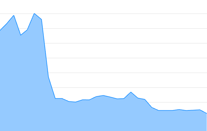
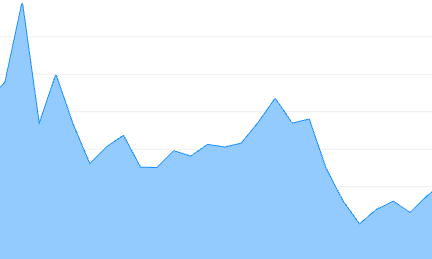
Digging more deep into the data, I wanted to understand how the device type influenced FID. If you think about, as mobile devices are less powerful than desktop and tablet devices, this makes them more "sensitive" to any performance improvement. Let's see this in practice.
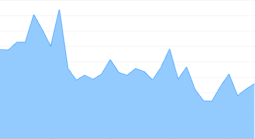
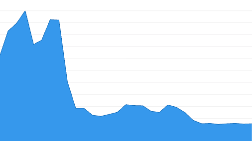
The p75 for desktop (the above picture in the left) was around 30ms and went down to 12ms-17ms. The p75 for mobile (the above picture in the right) was around 200ms and went down to 30ms.
Mobile devices were more sensitive to this improvement, it reduced by 85%. Huge gain and now it's running within the threshold (a good FID score is between 0ms and 100ms for p75).
The p95 also followed the same pattern.
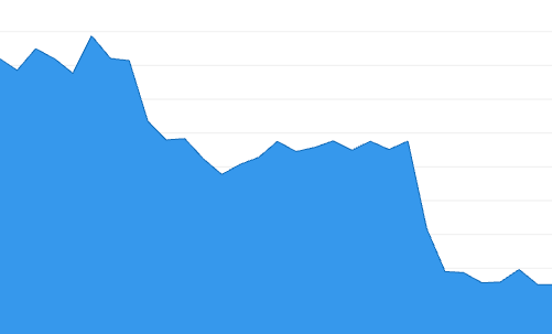
The desktop is in the left and the right is the mobile.
As we all know that performance is not a single number/score, it's a range of experiences, it becomes easier to read performance data showing a range of scores. A great way to read performance metrics like that are histograms.
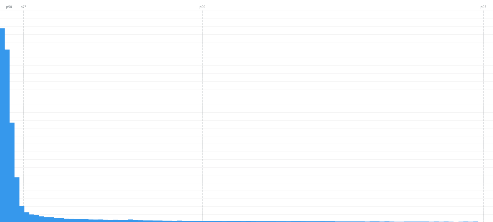
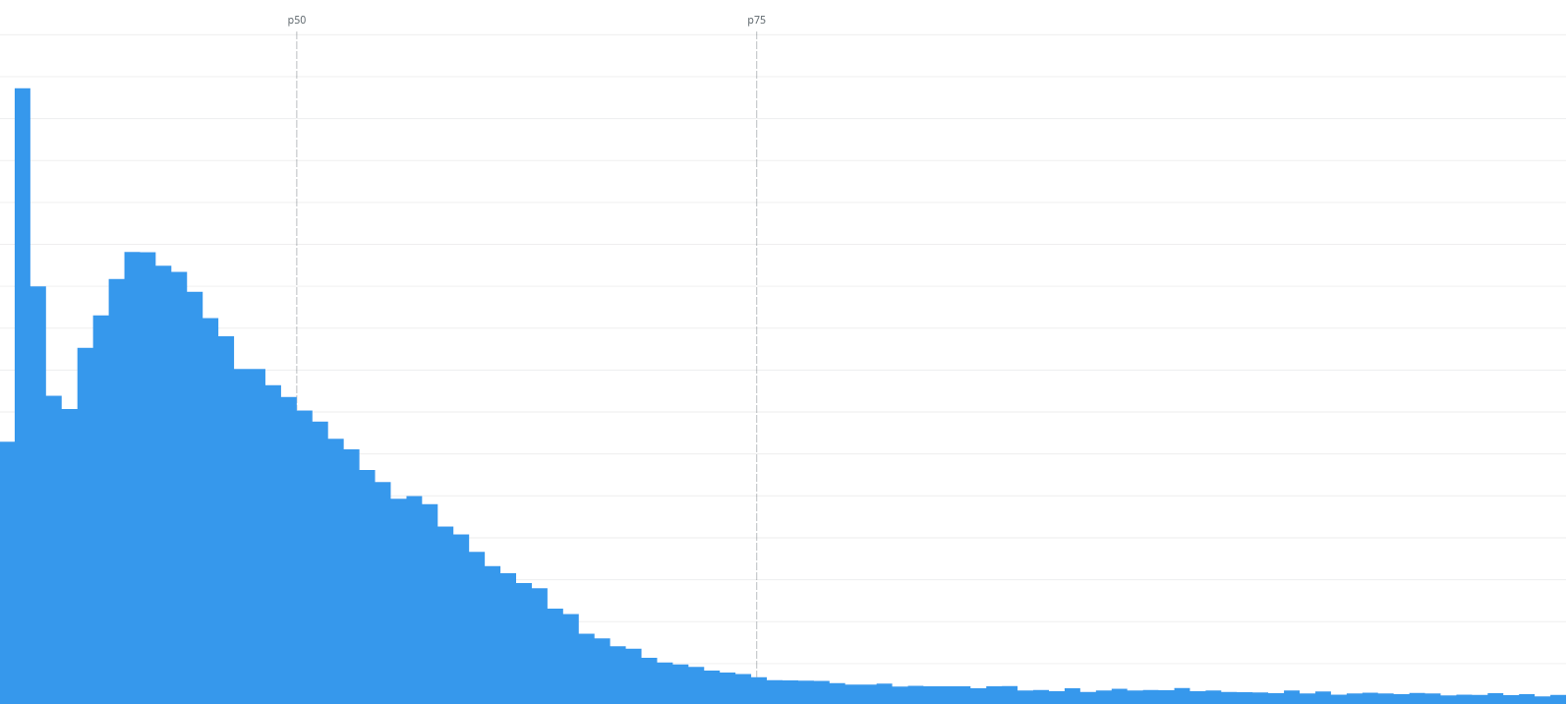
On the left, we can see the FID scores from 0s to 1s. Most of the scores are within the p75, that's great.
On the right, we can see a more focus vision of the same data but from 0ms to 100ms, the threshold for a good FID score. The p75 is 48ms, that's great too.
But if you look close to the 0s-1s histogram, we can still see people experiencing bad interactivity as the FID score go up to 1s. Datadog still doesn't allow us to group by network connection (3g, 4g, etc) so I grouped by country and continent as a proxy to understand how network connection influences the interactivity metric.
I think it's still not the best way to understand how it influences this metric but I found this info from the HTTP Archive's Almanac:
Regions in parts of Asia and Europe continued to have higher performance. This may be due to higher network speeds, wealthier populations with faster devices, and closer edge-caching locations. — link
In the "FID geomap", I see the poor experiences are from South America and more especifically from Africa. And in the FID p75 grouped by continent and device type, all continents had the same pattern. But I could see Africa on mobile was more sensitive to this improvement. It went from 450ms to only 35ms. The others had the same pattern but less sensitve. Still significant improvements though.
I am still trying to figure out why some people are experiencing this FID score. My guess is still "poor network connection" and less powerful devices as the main factor for bad FID scores.
As people still have these bad experiences, there're more things to optimize.
Future optimizations and experiments
This post is just the first optimization I did to improve the performance and thus the user experience. There are other experiments and investigations I want to do and share in the next blog posts.
Things on my To Do list:
- Investigate the most expensive components and hooks: re-architect, memoize, reduce the re-renders
- Getting only attributes from object references to reduce re-renders
- Code split parts of the page like login dialog, banners, and footer to reduce the size of JavaScript in the final bundle: less JS, less cost for the main thread
- Measure runtime performance with automated tests like Playwright
- And many other investigations and experiments I want to do
Resources
There are many resources about web performance out there. If you are interested in this topic, you should definitely follow the Web Performance Research repository.
There I'll be updating with new resources, doing more research, and writing my findings.
If you are a visual person, I created this visual roadmap to learn web performance based on the webperf research repo: Web Performance Roadmap.