Training ML Models for Cancer Tumor Classification
 Photo by Marius Masalar
Some months ago I've been studying hard the fundamental knowledge of Machine Learning. I started with the theoretical knowledge of mathematics and machine learning algorithms. While I was studying all that, I also pushed myself to get more practical and try to apply all this knowledge to some data challenges.
I stumbled upon this well-known breast cancer data set and the challenge is to predict whether the cancer tumor is malignant or benign based on different features that were collected and computed from a digitized image of a finale needle aspirate (FNA) of a breast mass.
In this post, I will explain how I developed a variety of ML models to predict the right target. The whole notebook is here: Breast Cancer Tumor Prediction repo.
These are the topics we're going to cover here:
Import & Data: importing libraries, loading data, and transforming it into a dataframeData Analysis & Exploration: exploring features, data types, missing values, removing unnecessary 'features', and analyzing data distribution and variable correlationOutlier Analysis: visually potential outliers, using z-score to spot those outliers, and building a dataframe without themData Preprocessing: separate the target from the predictors, label encode the target, and scale the data (both to the original dataframe and the one w/o outliers)Helper Functions: build functions to help with performing the predictions (test-training split and w/ PCA) and to plot graphs about the models' metricsML Models: perform predictions with different models (Naive Bayes, Logistic Regression, SVM, KNN, Decision Tree, Random Forest, XGBoost)Model Analysis & Comparison: compare all models' metrics
Import & Data
As often done, we start with importing all the libraries we will need to build the models, from data exploration to data preprocessing to the prediction model.
import numpy as np
import pandas as pd
import seaborn as sb
import matplotlib.pyplot as plt
import plotly.graph_objects as go

from plotly.subplots import make_subplots
from sklearn.preprocessing import LabelEncoder, StandardScaler
from sklearn.decomposition import PCA
from sklearn.pipeline import Pipeline
from sklearn.model_selection import train_test_split, KFold, cross_val_score, GridSearchCV, cross_val_predict
from sklearn.metrics import accuracy_score, classification_report
from sklearn.naive_bayes import GaussianNB
from sklearn.linear_model import LogisticRegression
from sklearn.neighbors import KNeighborsClassifier
from sklearn.tree import DecisionTreeClassifier
from sklearn.ensemble import RandomForestClassifier
from sklearn.svm import SVC
from xgboost import XGBClassifier
In this project, I used common libraries to handle data like numpy and pandas, handle graphs like matplotlib, seaborn, and plotly, and scikit-learn to handle the ML models, training, and performance metrics.
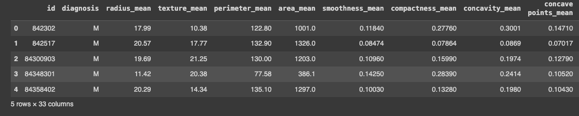
The second part of this step is to load the data and show the dataframe:
data = pd.read_csv('/breast_cancer/data.csv', sep=',', encoding='iso-8859-1')
data.head()
With that in place, we can now start exploring this data.
Data Analysis & Exploration
Now that I had the dataframe in place, I started to do some exploration. I noticed three things:
- There was an id: it didn't bring much value for the predictive model, I guessed
- The last column was a weird one: it was called
Unnamed: 32and all the data wasNaNvalues - The target is the
diagnosis: it's important to notice it's the only categorical — it can beM(for malignant) orB(for benign). If running thedata.dtypes, I could see that thediagnosiscolumn was anobjecttype and the other ones werefloat64.
Let's remove this unwanted information first:
data.drop(['id', 'Unnamed: 32'], axis=1, inplace=True)
data.head()
I just called the drop method and did the update in the data in place. Running data.head() just to make sure the columns were deleted.
Another part of this exploration was to check if there missing values in the data:
data.isnull().sum()
This displays a table with all the columns and the sum of all missing values for each of them. Fortunately, the data doesn't have any missing values, so no need to preprocess anything here.
Another part of this data exploration was exploring data distribution and variable correlation.
I got some of the variables to check the distribution and see if I could spot anything weird in the data.
fig, axes = plt.subplots(2, 3, figsize=(20, 8))

sb.histplot(data['area_mean'], ax = axes[0, 0])
sb.histplot(data['radius_mean'], ax = axes[0, 1])
sb.histplot(data['texture_mean'], ax = axes[0, 2])
sb.histplot(data['perimeter_mean'], ax = axes[1, 0])
sb.histplot(data['smoothness_mean'], ax = axes[1, 1])
sb.histplot(data['concavity_mean'], ax = axes[1, 2])
The idea here is just to choose some of the features and plot the data in the graph so we can visually spot issues.
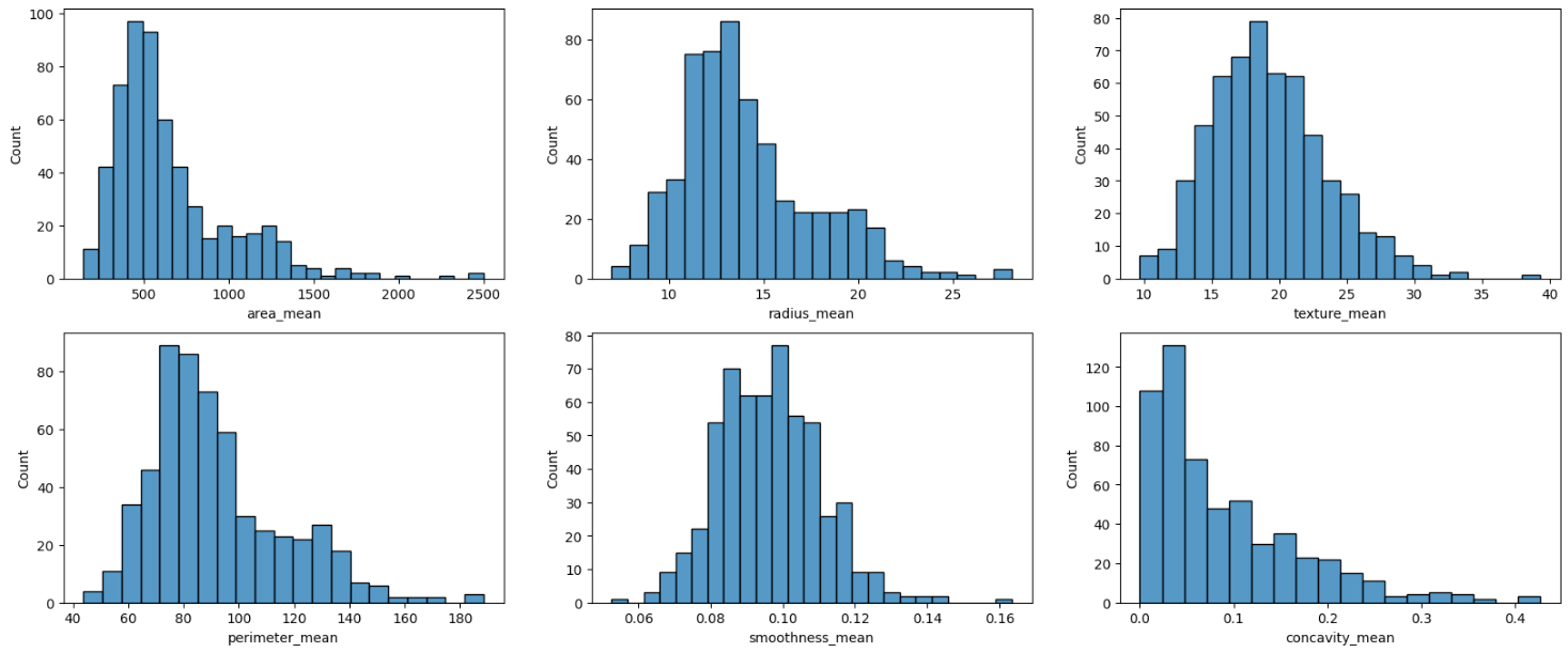
The first thought that I had was if there were some outliers in the data. This is a topic we are going to go into in-depth later on.
Regarding variable correlation, I built a heatmap to check this correlation among the data.
plt.figure(figsize=(20, 10))
heatmap = sb.heatmap(data.iloc[:, 1:].corr(), cmap='BrBG', annot=True)
heatmap.set_title('Correlation Heatmap', pad=12);
I did this only for the predictors, so there's no correlation with the target (diagnosis).
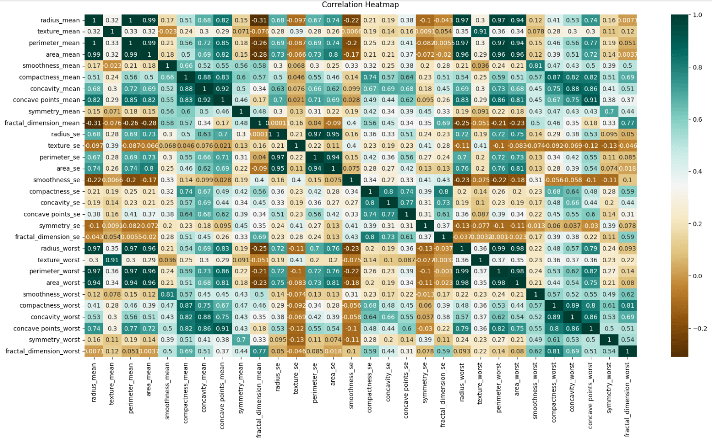
Heatmaps are really helpful in understanding relationships in the data, identifying multicollinearity, and detecting redundancies. That way we can start thinking and the preprocessing phase where we can do feature selection, remove highly correlated features to reduce overfitting, and check if it's worth applying Principal Component Analysis (PCA) and regularization.
I didn't include the target in the correlation heatmap, but I could do it and check the features with a high correlation to the target variable. They are often good candidates for inclusion in the model. The other ones with low or negative correlations might be excluded to simplify the model and reduce noise.
Outlier Analysis
We are still in the data exploration phase, but now focusing on outliers. Before I plotted distribution graphs that is helpful to analyze the data. One thing we can spot is potential outliers. But looking at this graph is not enough.
Another type of graph that is helpful is the box plot. To plot this type of graph, we use plotly's Box object to consume the data and output this type of graph for us.
In the following code, I chose some features to plot in the graph as examples to spot outliers.
fig = go.Figure()
names = data.columns[5:11]
values = []
colors = ['gold', 'mediumturquoise', 'darkorange', 'lightgreen','cyan', 'royalblue']

for column in data.iloc[:,5:11].columns:
  li = data[column].tolist()
  values.append(li)

for xd, yd, cls in zip(names, values, colors):
  fig.add_trace(go.Box(
    y=yd,
    name=xd,
    boxpoints='outliers',
    jitter=0.5,
    whiskerwidth=0.2,
    fillcolor=cls,
    marker_size=3,
    line_width=2)
  )

fig.show()
We have 6 features displayed in the graph. You can see some data points showing up. Those are potential outliers in each feature.
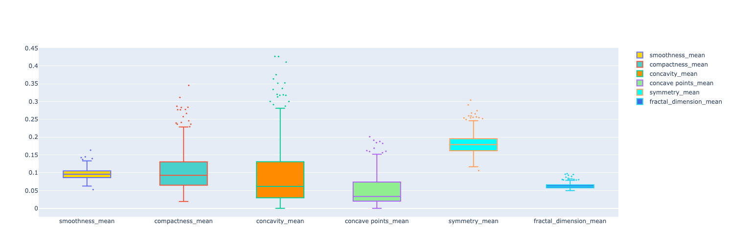
The idea in this stage is to start the preprocessing phase. I wanted to understand how the outliers would influence the output of the ML models I was training. The idea is to keep the original dataframe and create a new one without the outliers. That way we can compare the performance metrics of the models for both dataframes.
To remove the outliers and create this new dataframe, I needed to understand how I knew which data was an outlier or not. The whole idea is based on calculating the z-score and, for this case, if the z-score is greater than 3, it's a potential outlier and we then delete it from the dataframe.
The z-score is calculated by this formula:
Z = standard score x = observed value μ = mean of the sample 𝛔 = standard deviation of the sample
Here's how we build it in Python
mean = np.mean(data)
std_deviation = np.std(data)

def z_score(value):
  return (value - mean) / std_deviation
The second part is to go over the data, and for each observed value, we pass it to the z_score function and check if it's greater than 3. If it's you need to store it on a list of outliers.
Here's the whole code:
def get_outliers(data):
  mean = np.mean(data)
  std_deviation = np.std(data)

  def z_score(value):
    return (value - mean) / std_deviation

  outliers = []

  for value in data:
    if abs(z_score(value)) > 3:
      outliers.append(value)

  return outliers
We need to do it for each feature. But not only that, getting the value is important to check which values are but what I really wanted was the index of each outlier. That way I could use the list of indices to delete them from the dataframe.
This is how I improved the above code:
def get_outliers_with_row_index(data):
  mean = np.mean(data)
  std_deviation = np.std(data)

  def z_score(value):
    return (value - mean) / std_deviation

  outliers = []
  outliers_indices = []

  for index, value in enumerate(data):
    if abs(z_score(value)) > 3:
      outliers.append(value)
      outliers_indices.append(index)

  return outliers, outliers_indices
Now, I not only get the list of outliers but also the list of the outlier's indices.
- I just needed a new list:
outliers_indices - Using
enumerateto iterate through the data but now having access to the index - When we spot a potential outlier, push the index to the indices list
To test this code, I went over all the columns and passed the values of each one of them to this function to get the outliers and the indices.
indices = []

for col in data.select_dtypes(include=[np.number]).columns:
  outliers, outliers_indices = get_outliers_with_row_index(data[col].values)
  indices.append(outliers_indices)
  print(f"Possible outliers in column '{col}': {outliers}")
This is how it looked like when printing the column and the potential outliers.
Possible outliers in column 'radius_mean': [25.22, 27.22, 28.11, 25.73, 27.42]
Possible outliers in column 'texture_mean': [32.47, 33.81, 39.28, 33.56]
Possible outliers in column 'perimeter_mean': [171.5, 166.2, 182.1, 188.5, 174.2, 186.9, 165.5]
Possible outliers in column 'area_mean': [1878.0, 1761.0, 2250.0, 2499.0, 1747.0, 2010.0, 2501.0, 1841.0]
Possible outliers in column 'smoothness_mean': [0.1425, 0.1398, 0.1447, 0.1634, 0.05263]
Possible outliers in column 'compactness_mean': [0.2776, 0.2839, 0.3454, 0.2665, 0.2768, 0.2867, 0.2832, 0.3114, 0.277]
Possible outliers in column 'concavity_mean': [0.3754, 0.3339, 0.4264, 0.4268, 0.4108, 0.3523, 0.3368, 0.3635, 0.3514]
Possible outliers in column 'concave points_mean': [0.1845, 0.1823, 0.2012, 0.1878, 0.1913, 0.1689]
Possible outliers in column 'symmetry_mean': [0.304, 0.2743, 0.2906, 0.2655, 0.2678]
Possible outliers in column 'fractal_dimension_mean': [0.09744, 0.0898, 0.09296, 0.08743, 0.0845, 0.09502, 0.09575]
Possible outliers in column 'radius_se': [1.509, 1.296, 2.873, 1.292, 1.37, 2.547, 1.291]
Possible outliers in column 'texture_se': [3.568, 2.91, 3.12, 4.885, 2.878, 3.647, 2.927, 2.904, 3.896]
Possible outliers in column 'perimeter_se': [11.07, 10.05, 9.807, 21.98, 10.12, 9.424, 18.65, 9.635]
Possible outliers in column 'area_se': [233.0, 525.6, 199.7, 224.1, 542.2, 180.2]
Possible outliers in column 'smoothness_se': [0.01721, 0.01835, 0.02333, 0.03113, 0.02075, 0.01736, 0.02177]
Possible outliers in column 'compactness_se': [0.08297, 0.1006, 0.08606, 0.09368, 0.08668, 0.09806, 0.09586, 0.08808, 0.1354, 0.08555, 0.08262, 0.1064]
Possible outliers in column 'concavity_se': [0.3038, 0.1435, 0.1278, 0.396, 0.1438, 0.1535]
Possible outliers in column 'concave points_se': [0.0409, 0.03322, 0.05279, 0.03927, 0.03487, 0.03441]
Possible outliers in column 'symmetry_se': [0.05963, 0.05333, 0.07895, 0.05014, 0.04547, 0.05168, 0.05628, 0.05113, 0.04783, 0.06146, 0.05543]
Possible outliers in column 'fractal_dimension_se': [0.01284, 0.02193, 0.01298, 0.01178, 0.02984, 0.01792, 0.01256, 0.02286, 0.0122, 0.01233]
Possible outliers in column 'radius_worst': [33.12, 31.01, 32.49, 33.13, 36.04, 30.79]
Possible outliers in column 'texture_worst': [45.41, 44.87, 49.54, 47.16]
Possible outliers in column 'perimeter_worst': [211.7, 220.8, 214.0, 229.3, 251.2, 211.5]
Possible outliers in column 'area_worst': [2615.0, 3216.0, 2944.0, 3432.0, 2906.0, 3234.0, 3143.0, 4254.0, 2782.0, 2642.0]
Possible outliers in column 'smoothness_worst': [0.2098, 0.2226, 0.2184]
Possible outliers in column 'compactness_worst': [0.8663, 1.058, 0.7725, 0.7444, 0.7394, 0.7584, 0.9327, 0.9379, 0.7917, 0.8681]
Possible outliers in column 'concavity_worst': [1.105, 1.252, 0.9608, 0.9034, 0.9019, 1.17, 0.9387]
Possible outliers in column 'concave points_worst': []
Possible outliers in column 'symmetry_worst': [0.6638, 0.4761, 0.4863, 0.544, 0.4882, 0.5774, 0.5166, 0.5558, 0.4824]
Possible outliers in column 'fractal_dimension_worst': [0.173, 0.2075, 0.1431, 0.1402, 0.1405, 0.1486, 0.1446, 0.1403, 0.1409]
I not only can inspect the outliers but I also have the list of the indices that will be used the delete them from the dataframe.
The problem is that the indices list is still a list of lists. We need to flatten it. So I built this function:
def flatten(array):
  return [item for sublist in array for item in sublist]
And then I can use it to flatten the list and then do a few more operations on top of it:
flattened_list = flatten(indices)
outlier_rows = sorted(list(set(flattened_list)))
Let's break down what's going on here:
- First, we flatten the list
- Then I wanted to have only unique indices, so I used a
setdata structure to handle that for me - After having unique values in the set, we can transform it back into a list
- Then I sorted the indices so it was easier to understand the data
With that in place, I used the drop method to remove the outliers from the dataframe creating a new one separate from the original dataframe. That way we can compare the different models we'll train soon.
data_without_outliers = data.drop(index=outlier_rows)
data_without_outliers.head()
After dropping the outliers, I used the head method to check the data: the outliers were not in this dataframe.
Data Preprocessing
In this phase, I wanted to do three things:
- Separate the predictors from the target
- Transform the target from a categorical label into a numerical variable
- Scale the predictors: transform predictor values to be in the same scale
And I did it for both the original dataframe and the new dataframe without the outliers.
Let's tackle the original dataframe first and then we can apply the same principles to the one without the outliers.
Separating the predictors from the target is easy. We can simply use the iloc to get the right columns:
predictors = data.iloc[:, 1:].values
target = data.iloc[:, 0:1].values
This is how it's broken down:
- predictors: all the rows from the second and beyond
- target: all the rows but only the first column (
diagnosis)
The second step is to transform the target from a categorical label into a numerical variable. We do this by using the LabelEncoder:
target = LabelEncoder().fit_transform(target.ravel())
target = target.reshape(-1, 1)
To use the LabelEncoder, we need to transform the target from a “matrix” into a flattened array. We do that using the ravel method. It fits and transforms the data and we assign it to the target variable. But before moving on, we need to transform it back to a “matrix”.
The third step is to scale the predictors. The idea here is to have all the predictors on the same scale, train the models with that data, and compare the performance metrics.
To scale the predictors, we can use the StandardScaler.
scaled_predictors = StandardScaler().fit_transform(predictors)
In your notebook, you can also run the dataframe to check if the predictors are not on the same scale:
pd.DataFrame(scaled_predictors)
Now we move on from the original dataframe and do the same steps for the one without outliers.
Setup predictors and target:
predictors_without_outliers = data_without_outliers.iloc[:, 1:].values
target_without_outliers = data_without_outliers.iloc[:, 0:1].values
Encode target: nominal to numerical variable
target_without_outliers = LabelEncoder().fit_transform(target_without_outliers.ravel())
target_without_outliers = target_without_outliers.reshape(-1, 1)
Scale predictors:
scaled_predictors_without_outliers = StandardScaler().fit_transform(predictors_without_outliers)
Now we have all the predictors and targets that will be used to train our models. Here are all of them:
# from original dataframe
predictors
target
scaled_predictors

# without outliers
predictors_without_outliers
target_without_outliers
scaled_predictors_without_outliers
Helper Functions
Before moving on to the model training I wrote some helper functions to make my life easier to run the models. This idea came from updating one model and then I needed to update all the other ones too. Maybe that's the software engineer side of me talking, but abstracting each line of code into these functions made it all easier.
First I defined some constants that will be used in the models:
kfold = KFold(n_splits = 30, shuffle=True, random_state = 5)
malignant = 1
The kfold will be used to perform cross-validation in our models and the malignant is just an easier way to get the metrics from the report that are related to the class.
Then I created a function to split the data with some defined parameters.
def split_data():
  return train_test_split(
    predictors,
    target,
    test_size = 0.3,
    random_state = 0
  )
Notice that I'm using only the predictors and the target here and not the ones without the outliers. This function will only be used for the models trained after passing through PCA. With the fixed parameters, it will have the same output for every number of PCA's components. We don't want it to vary.
The next two functions are ways to plot the performance metrics for us.
The first one is the plot_with_vs_without_pca:
def plot_with_vs_without_pca(metrics, training_score, test_score, cv_score, score_type):
  score_type_string = score_type.capitalize()

  fig = make_subplots(
    rows=1, cols=3,
    specs=[[{"type": "scatter"}, {"type": "scatter"}, {"type": "scatter"}]],
    subplot_titles=(f'# of Components in PCA versus Model {score_type_string}')
  )

  cv = metrics['cv']
  test = metrics['test']
  training = metrics['training']
  length = len(cv[score_type]) + 1

  fig.add_trace(go.Scatter(x=list(range(1, length)), mode='markers+lines', y=training[score_type], line=dict(color='rgb(0,255,0)', width=2), name='Training score'), row=1, col=1)
  fig.update_xaxes(title_text='# of components')
  fig.update_yaxes(title_text=score_type_string, row=1, col=1)

  fig.add_trace(go.Scatter(x=list(range(1, length)), mode='markers+lines', y=test[score_type], line=dict(color='rgb(0,176,246)', width=2), name='Test score'), row=1, col=2)
  fig.update_xaxes(title_text='# of components')
  fig.update_yaxes(title_text=score_type_string, row=1, col=2)

  fig.add_trace(go.Scatter(x=list(range(1, length)), mode='markers+lines', y=cv[score_type], line=dict(color='rgb(231,107,243)', width=2), name='CV score'), row=1, col=3)
  fig.update_xaxes(title_text='# of components')
  fig.update_yaxes(title_text=score_type_string, row=1, col=3)

  fig.add_trace(
    go.Scatter(
      x=[0, length],
      y=[training_score, training_score],
      mode='lines',
      line=dict(
        color="RoyalBlue",
        width=3,
        dash="dash"
      ),
      name=f'Training {score_type_string}'
    ),
    row=1,
    col=1
  )

  fig.add_trace(
    go.Scatter(
      x=[0, length],
      y=[test_score, test_score],
      mode='lines',
      line=dict(
        color="Red",
        width=3,
        dash="dash"
      ),
      name=f'Test {score_type_string}'
    ),
    row=1,
    col=2
  )

  fig.add_trace(
    go.Scatter(
      x=[0, length],
      y=[cv_score, cv_score],
      mode='lines',
      line=dict(
        color="Yellow",
        width=3,
        dash="dash"
      ),
      name=f'CV {score_type_string}'
    ),
    row=1,
    col=3
  )

  fig.update_layout(
    annotations=[
      go.layout.Annotation(
        x=0.16,
        y=1.05,
        xref="paper",
        yref="paper",
        text="Training Scores Comparison",
        showarrow=False,
        font=dict(size=14)
      ),
      go.layout.Annotation(
        x=0.5,
        y=1.05,
        xref="paper",
        yref="paper",
        text="Test Scores Comparison",
        showarrow=False,
        font=dict(size=14)
      ),
      go.layout.Annotation(
        x=0.85,
        y=1.05,
        xref="paper",
        yref="paper",
        text="CV Scores Comparison",
        showarrow=False,
        font=dict(size=14)
      )
    ]
  )

  fig.show()
The idea of this one is to plot 3 graphs based on the type of score:
- Training Scores: a graph of accuracy, precision, or recall varying with the increase of PCA components + a line with the training score without PCA
- Test Scores: a graph of accuracy, precision, or recall varying with the increase of PCA components + a line with the test score without PCA
- CV Scores: a graph of accuracy, precision, or recall varying with the increase of PCA components + a line with the CV score without PCA
That way we can compare the model score with the PCA scores.
The second is the plot_PCA:
def plot_PCA(metrics):
  fig = make_subplots(
    rows=1, cols=3,
    specs=[[{"type": "scatter"}, {"type": "scatter"}, {"type": "scatter"}]],
    subplot_titles=('# of Components in PCA versus Model Accuracy')
  )

  cv = metrics['cv']
  test = metrics['test']
  training = metrics['training']

  fig.add_trace(go.Scatter(x=list(range(1, len(cv['accuracy']) + 1)), mode='markers+lines', y=cv['accuracy'], line=dict(color='rgb(231,107,243)', width=2), name='CV score'), row=1, col=1)
  fig.add_trace(go.Scatter(x=list(range(1, len(test['accuracy']) + 1)), mode='markers+lines', y=test['accuracy'], line=dict(color='rgb(0,176,246)', width=2), name='Test score'), row=1, col=1)
  fig.add_trace(go.Scatter(x=list(range(1, len(training['accuracy']) + 1)), mode='markers+lines', y=training['accuracy'], line=dict(color='rgb(0,255,0)', width=2), name='Training score'), row=1, col=1)
  fig.update_xaxes(title_text='# of components')
  fig.update_yaxes(title_text='Accuracy', row=1, col=1)

  fig.add_trace(go.Scatter(x=list(range(1, len(cv['precision']) + 1)), mode='markers+lines', y=cv['precision'], line=dict(color='rgb(231,107,243)', width=2), name='CV score', showlegend=False), row=1, col=2)
  fig.add_trace(go.Scatter(x=list(range(1, len(test['precision']) + 1)), mode='markers+lines', y=test['precision'], line=dict(color='rgb(0,176,246)', width=2), name='Test score', showlegend=False), row=1, col=2)
  fig.add_trace(go.Scatter(x=list(range(1, len(training['precision']) + 1)), mode='markers+lines', y=training['precision'], line=dict(color='rgb(0,255,0)', width=2), name='Training score', showlegend=False), row=1, col=2)
  fig.update_xaxes(title_text='# of components')
  fig.update_yaxes(title_text='Precision', row=1, col=2)

  fig.add_trace(go.Scatter(x=list(range(1, len(cv['recall']) + 1)), mode='markers+lines', y=cv['recall'], line=dict(color='rgb(231,107,243)', width=2), name='CV score', showlegend=False), row=1, col=3)
  fig.add_trace(go.Scatter(x=list(range(1, len(test['recall']) + 1)), mode='markers+lines', y=test['recall'], line=dict(color='rgb(0,176,246)', width=2), name='Test score', showlegend=False), row=1, col=3)
  fig.add_trace(go.Scatter(x=list(range(1, len(training['recall']) + 1)), mode='markers+lines', y=training['recall'], line=dict(color='rgb(0,255,0)', width=2), name='Training score', showlegend=False), row=1, col=3)
  fig.update_xaxes(title_text='# of components')
  fig.update_yaxes(title_text='Recall', row=1, col=3)

  fig.show()
This one also plots 3 graphs
- Accuracy: how accuracy changes with the increase of PCA components
- Precision: how precision changes with the increase of PCA components
- Recall: how recall changes with the increase of PCA components
All three 3 have three lines: the training score, the test score, and the CV score.
Later on, we'll see these graphs in practice and how these functions will come in handy. For now, just trust me that they will plot the metrics in the graph and we'll be able to visualize and make sense of them.
The last 2 functions are the most important ones:
make_prediction: train the model, classify the test data, and do cross-validation and store the scores for each data (training, test, CV)make_pca_prediction: basically the same idea ofmake_predictionbut before training the data, we use PCA to reduce the dimensionality
Let's see the implementation of both functions now:
def make_prediction(model, cv_model, predictors, target):
  flattened_target = target.ravel()
  x_training, x_test, y_training, y_test = train_test_split(predictors, flattened_target, test_size = 0.3, random_state = 0)
  model.fit(x_training, y_training)

  training_prediction = model.predict(x_training)
  training_report = classification_report(y_training, training_prediction, output_dict=True)
  print("Training Accuracy: %.2f%%" % (training_report['accuracy'] * 100.0))

  test_prediction = model.predict(x_test)
  test_report = classification_report(y_test, test_prediction, output_dict=True)
  print("Test Accuracy: %.2f%%" % (test_report['accuracy'] * 100.0))

  cv_prediction = cross_val_predict(cv_model, predictors, flattened_target, cv=kfold)
  cv_report = classification_report(flattened_target, cv_prediction, output_dict=True)
  print("Cross validation Accuracy: %.2f%%\n" % (cv_report['accuracy'] * 100.0))

  metrics = {
    'training': {
      'accuracy': training_report['accuracy'],
      'precision': training_report[str(malignant)]['precision'],
      'recall': training_report[str(malignant)]['recall']
    },
    'test': {
      'accuracy': test_report['accuracy'],
      'precision': test_report[str(malignant)]['precision'],
      'recall': test_report[str(malignant)]['recall']
    },
    'cv': {
      'accuracy': cv_report['accuracy'],
      'precision': cv_report[str(malignant)]['precision'],
      'recall': cv_report[str(malignant)]['recall']
    }
  }

  return metrics
The first step of this function is to split the data into training and test sets. Then we use the training data to train the model. Notice that the model is passed as a parameter, that way, we make the function more abstract and make sure that we can train all the ML models with this function, we just need to pass the model we want to use.
After training the model, it has all the parameters figured out. Now, we just need to get the accuracy, precision, and recall scores from the training and test data. With that, we already have the training and test scores but it's still missing CV.
For CV, we need a new instance of the model and also pass a parameter to the function. We did it separately from the first model because I didn't want to pollute the CV model with the data we were training in the first step. We use cross_val_predict to do a CV and get the accuracy, precision, and recall scores.
Finally, we just need to return the metrics of training, test, and CV.
For make_pca_prediction, it's basically the same idea: we will train the model, do CV, and get accuracy, precision, and recall scores from all of them. But as I said before, it should use PCA to reduce the dimensionality. Before PCA, we should scale the predictors:
x_training, x_test, y_training, y_test = data
scaler = StandardScaler()
scaled_predictors_training = scaler.fit_transform(x_training)
scaled_predictors_test = scaler.transform(x_test)
Then we can use PCA:
pca = PCA(n_components=components)
x_pca_training = pca.fit_transform(scaled_predictors_training)
x_pca_test = pca.transform(scaled_predictors_test)
Notice we pass a components value and this value will be received from the function. Wait a bit and I'll show you soon.
And then we do the same thing we did for the previous function but with a slight difference:
split_model.fit(x_pca_training, y_training.ravel());

training_prediction = split_model.predict(x_pca_training)
training_score = accuracy_score(y_training, training_prediction)
print("Training Accuracy: %.2f%%" % (training_score * 100.0))

report = classification_report(y_training, training_prediction, output_dict=True)
metrics['training']['accuracy'].append(report['accuracy'])
metrics['training']['precision'].append(report[str(malignant)]['precision'])
metrics['training']['recall'].append(report[str(malignant)]['recall'])

test_prediction = split_model.predict(x_pca_test)
test_score = accuracy_score(y_test, test_prediction)
print("Test Accuracy: %.2f%%" % (test_score * 100.0))

report = classification_report(y_test, test_prediction, output_dict=True)
metrics['test']['accuracy'].append(report['accuracy'])
metrics['test']['precision'].append(report[str(malignant)]['precision'])
metrics['test']['recall'].append(report[str(malignant)]['recall'])
We also get the accuracy, precision, and recall scores
We do that by using the classification_report and in this report, we can get all this information and then store it into the metrics variable.
Moving on, we also need to do the same thing for cross-validation.
pipeline = Pipeline([
  ('scaler', StandardScaler()),
  ('pca', PCA(n_components=components)),
  ('model', cv_model)
])

cv_score = cross_val_score(pipeline, predictors, target.ravel(), cv=kfold)
cv_prediction = cross_val_predict(pipeline, predictors, target.ravel(), cv=kfold)
print("Cross validation Accuracy: %.2f%%\n" % (cv_score.mean() * 100.0))

report = classification_report(target.ravel(), cv_prediction, output_dict=True)
metrics['cv']['accuracy'].append(report['accuracy'])
metrics['cv']['precision'].append(report[str(malignant)]['precision'])
metrics['cv']['recall'].append(report[str(malignant)]['recall'])
Here I used the Pipeline to do the scaling and PCA in each k-fold for cross-validation.
And then, that's pretty much the same thing as we did before: get the report and store the metrics in the metrics variable.
Here's the entire function:
def make_pca_prediction(data, metrics, split_model, cv_model, components):
  print(f"==== Components N: {components} ====")

  x_training, x_test, y_training, y_test = data
  scaler = StandardScaler()
  scaled_predictors_training = scaler.fit_transform(x_training)
  scaled_predictors_test = scaler.transform(x_test)

  pca = PCA(n_components=components)
  x_pca_training = pca.fit_transform(scaled_predictors_training)
  x_pca_test = pca.transform(scaled_predictors_test)

  split_model.fit(x_pca_training, y_training.ravel());

  training_prediction = split_model.predict(x_pca_training)
  training_score = accuracy_score(y_training, training_prediction)
  print("Training Accuracy: %.2f%%" % (training_score * 100.0))

  report = classification_report(y_training, training_prediction, output_dict=True)
  metrics['training']['accuracy'].append(report['accuracy'])
  metrics['training']['precision'].append(report[str(malignant)]['precision'])
  metrics['training']['recall'].append(report[str(malignant)]['recall'])

  test_prediction = split_model.predict(x_pca_test)
  test_score = accuracy_score(y_test, test_prediction)
  print("Test Accuracy: %.2f%%" % (test_score * 100.0))

  report = classification_report(y_test, test_prediction, output_dict=True)
  metrics['test']['accuracy'].append(report['accuracy'])
  metrics['test']['precision'].append(report[str(malignant)]['precision'])
  metrics['test']['recall'].append(report[str(malignant)]['recall'])

  # === PCA + Cross-Validation

  pipeline = Pipeline([
    ('scaler', StandardScaler()),
    ('pca', PCA(n_components=components)),
    ('model', cv_model)
  ])

  cv_score = cross_val_score(pipeline, predictors, target.ravel(), cv=kfold)
  cv_prediction = cross_val_predict(pipeline, predictors, target.ravel(), cv=kfold)
  print("Cross validation Accuracy: %.2f%%\n" % (cv_score.mean() * 100.0))

  report = classification_report(target.ravel(), cv_prediction, output_dict=True)
  metrics['cv']['accuracy'].append(report['accuracy'])
  metrics['cv']['precision'].append(report[str(malignant)]['precision'])
  metrics['cv']['recall'].append(report[str(malignant)]['recall'])
Finally, we finished implementing helper functions and are now ready to start training the models, seeing the results, and analyzing the performance metrics.
ML models
For each ML model, we'll do 4 things: classify based on the original data set, classify the data set without the outliers, classify preprocessing with PCA, and finally, analyze the performance and compare the scores.
Here are all the models we are going to train:
- Naive Bayes
- Logistic Regression
- SVM
- KNN
- Decision Tree
- Random Forest
- XGBoost
Let's start with Naive Bayes.
We can make the prediction using the model from scikit-learn. The model from this library is called GaussianNB. Let's see how we can use the helper functions we created before to make the predictions:
predictors_scores = make_prediction(
  GaussianNB(),
  GaussianNB(),
  predictors,
  target
)
The first model is for the test-training data split and the second model is for the cross-validation.
The make_prediction function will output the metrics for us: accuracy, precision, and recall scores.
Then, we do the same for the dataframe without the outliers:
predictors_scores = make_prediction(
  GaussianNB(),
  GaussianNB(),
  predictors_without_outliers,
  target_without_outliers.ravel()
)
Pretty much the same idea, but passing the predictors and target without the outliers. We also get the same metrics as previously.
For PCA, it's slightly different because we need to go over different numbers of components for PCA and then make the prediction.
metrics = init_metrics()
data = split_data()

for components in range(1, 15):
  make_pca_prediction(data, metrics, GaussianNB(), GaussianNB(), components)
First, we initialize the metrics object that will be used to store all the metrics across each PCA component. Secondly, we split the data into training and testing before iterating through all the components and then predicting with PCA.
Notice we will experiment with components from 1 to 15 so we have a lot of different scores and can plot them in the graph to visualize how it varies with the increase of components.
After making all the predictions, we just need to do the performance analysis:
- Comparing scores related to each number of components in PCA
- Comparing scores among PCA, original dataframe, and the data without outliers
First, we run the function to plot the PCA graph for us:
plot_PCA(metrics)
It will output this kind of graph:
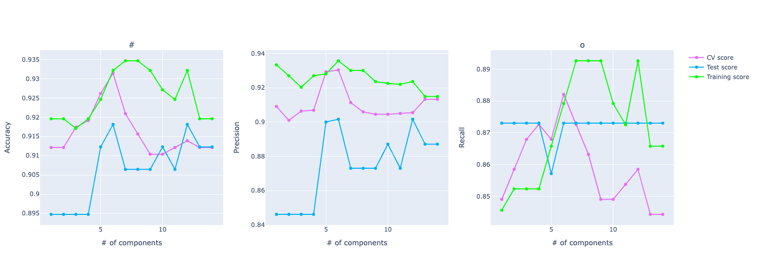
Here we have three graphs: one for accuracy, one for precision, and the other for recall. And it shows how each one of them varies with the increase in the number of PCA components.
The idea of Principal Component Analysis (PCA) is to reduce the dimensionality, especially for large data sets, by transforming a large set of variables into a smaller one that still contains most of the information in the large set. The goal is to extract the important information from the data and to express this information as a set of summary indices called principal components. The TLDR is: PCA reduces the number of variables of a data set while preserving as much information as possible.
One behavior is very common in PCA: when increasing the number of components, it has an improvement in the score but then the score stabilizes or even gets worse.
It's because as you increase the number of components in PCA, you start including components that explain less variance in the data. These components may capture noise or irrelevant patterns, which can confuse the model, leading to a decrease in the metric.
Another insightful information from this graph is that we can compare training, test, and CV. Underfitting and overfitting are important concepts we can extract from these graphs. Or at least have a smell it's behaving either way.
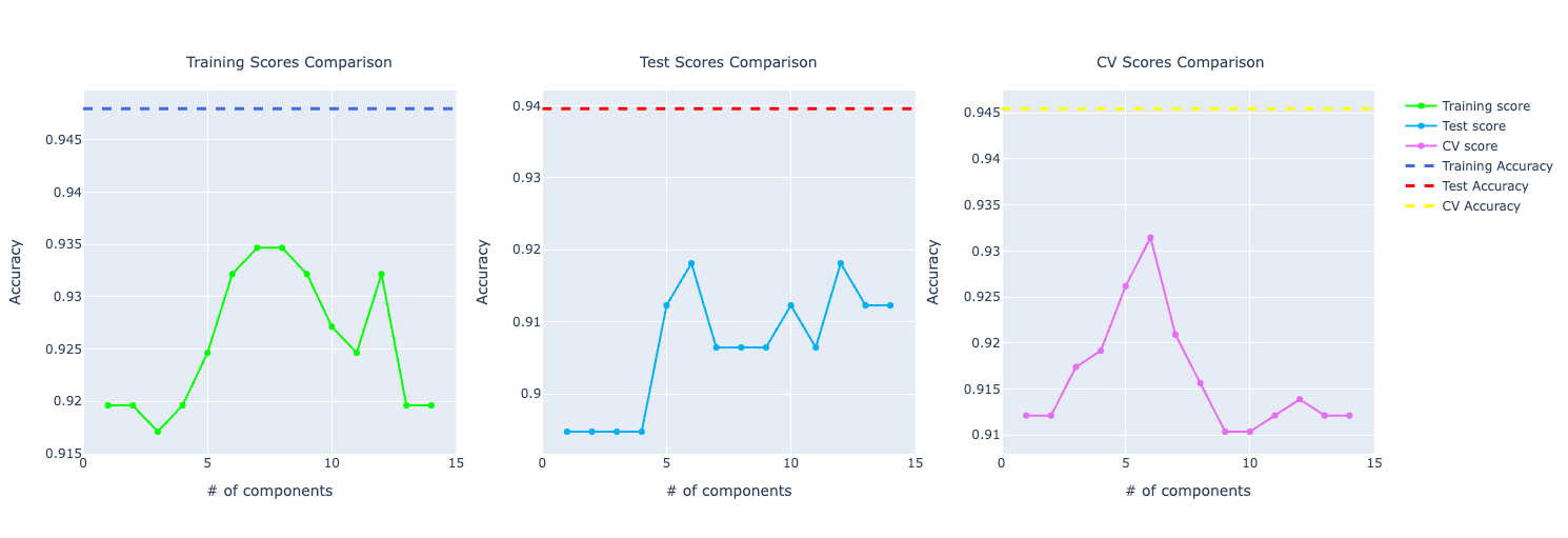
The other function is the plot_with_vs_without_pca:
for score_type in ['accuracy', 'precision', 'recall']:
  plot_with_vs_without_pca(metrics, predictors_scores['training'][score_type], predictors_scores['test'][score_type], predictors_scores['cv'][score_type], score_type)
Here we want to plot the same PCA graph but now comparing with the score from the model without PCA. An important insight here is how PCA is performing compared to the prediction model without PCA. We have a dashed line representing that. If it's on top of the PCA line, the prediction model without PCA is performing better. If it's at the bottom, it's worse. And it's performing similarly if have similar behavior.
Even though it's important to compare that, it doesn't have the complete information to make a decision. For example, we don't know if the prediction model is overfitting or not so it can be misleading to choose that model only based on a specific score.
Here's an example of one line of graphs plotted:
Training a Naive Bayes model created a blueprint on how I would approach any other algorithm for this problem. The idea is the same: we fit the model to the data, do the prediction, get results from the training data, the test data, and do cross-validation. Then, we just need to plot the metrics and do the analysis.
The difference is not even the API but only the model used. So, for example, rather than using an instance of a GaussianNB, if I want to train a logistic regression model, I would use an instance of LogisticRegression.
From my manual tests, this was the model with best configuration (hyperparameters tuning):
predictors_scores = make_prediction(
  LogisticRegression(random_state=1, max_iter=600, penalty="l2", tol=0.0001, C=1, solver="lbfgs"),
  LogisticRegression(random_state=1, max_iter=600, penalty="l2", tol=0.0001, C=1, solver="lbfgs"),
  predictors,
  target.ravel()
)
I even used GridSearchCV to automatically find a better set of hyperparameters but none of them had a better performance than this one. These are the ones I experimented with GridSearchCV:
param_grid = {
  'C': [0.001, 0.01, 0.1, 1, 10, 100],
  'max_iter': [100, 200, 300, 400, 500, 600],
  'penalty': ['l1', 'l2'],  # Note: 'l1' only for 'liblinear' solver
  'tol': [1e-4, 1e-3, 1e-2, 1e-1],
  'solver': ['newton-cg', 'lbfgs', 'liblinear', 'saga']
}
Now, we just need to classify based on the data without outliers and the data with PCA. And then, plot the graphs for the performance metrics for comparison.
All the other models are pretty much the same, so instead of writing the same thing over and over again, I will just let you know the instances I was using for each algorithm and the hyperparameters for each.
# Support Vector Machine (SVM)
SVC(kernel='rbf', random_state=1, C = 2)

# K-Nearest Neighbors (KNN)
KNeighborsClassifier(n_neighbors=7, metric='minkowski', p = 1)

# Decision Tree
DecisionTreeClassifier(criterion='entropy', random_state = 0, max_depth=3)

# Random Forest
RandomForestClassifier(n_estimators=150, criterion='entropy', random_state = 0, max_depth=4)

# XGBoost
XGBClassifier(max_depth=2, learning_rate=0.05, n_estimators=250, objective='binary:logistic', random_state=3)
Now we have trained all those models and we are not ready to do some performance analysis and check the results and compare them.
Performance Analysis
For the analysis of these metrics, it was important to first understand the problem. We have a cancer tumor and we want to classify it as malignant or benign.
Accuracy is important here because we want to know how we correctly classify both types of tumors. That means that generally the higher the score, the better the model is predicting the type of tumor.
Precision is also important because we want to understand the quality of the malignant prediction. A high precision (for the positive label) means that when the model predicts a tumor is malignant, it is likely correct. This is important to avoid false positives, where a benign tumor is mistakenly identified as malignant, causing unnecessary stress or treatment.
And the last one is Recall. It measures the proportion of actual malignant tumors that were correctly identified by the model. High recall means the model is good at identifying most malignant tumors. Low recall means the model is mistakenly classifying more actual malignant tumor as benign, which can be a severe error (e.g. have a delayed treatment).
We could have more metrics for this problem, but these are already a good starting point.
Naive Bayes
Here is the performance of this model:
Original data set
- Training Accuracy: 94.22%
- Test Accuracy: 92.40%
- Cross validation Accuracy: 93.85%
Data set without outliers
- Training Accuracy: 94.80%
- Test Accuracy: 93.96%
- Cross validation Accuracy: 94.55%
PCA: 6 components
- Training Accuracy: 93.32%
- Test Accuracy: 91.81%
- Cross validation Accuracy: 93.14%
When plotting the graph with accuracy of the original data set compare to the one trained with PCA, we could see that the one with the original data set was performing way better.
And if you put the model trained with the data set without outliers, the performance got even better:
- Training: going from 94.22% to 94.80%
- Test: from 92.40% to 93.96%
- Cross-validation: from 93.85% to 94.55%
It was also important to notice that if we compare the three (training, test, and CV), they don't vary that much, which is an indication that the model is not overfitting. Even though the training performance is 94%, it's performing well on unseen data too (test/CV).
For precision and recall, the comparison looks very similar to the accuracy one. The model trained on the original data set performed better than PCA.
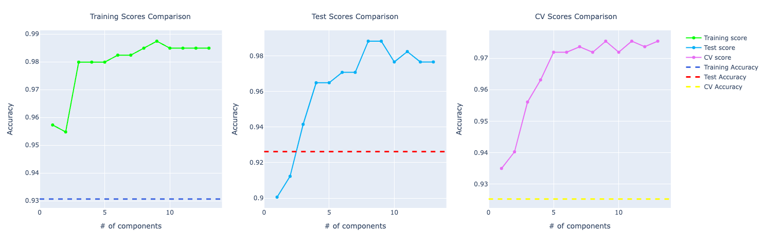
Logistic Regression
Original data set:
- Training Accuracy: 95.48%
- Test Accuracy: 96.49%
- Cross validation Accuracy: 95.25%
Data set without outliers
- Training Accuracy: 95.95%
- Test Accuracy: 93.96%
- Cross validation Accuracy: 94.75%
PCA: 4 components
- Training Accuracy: 98.24%
- Test Accuracy: 97.07%
- Cross validation Accuracy: 97.36%
Comparing the performance, we can see the model with PCA is performing better. I chose to show the one trained with 4 components because I wanted a good performance but also make sure that the training, test, and cross-validation scores were approximated so possibly no overfitting, especially because with PCA, the accuracy score for the training test was very high.
Precision and recall follow accuracy. The model trained with PCA is performing better than the other two, especially for recall which has a huge importance for this problem:
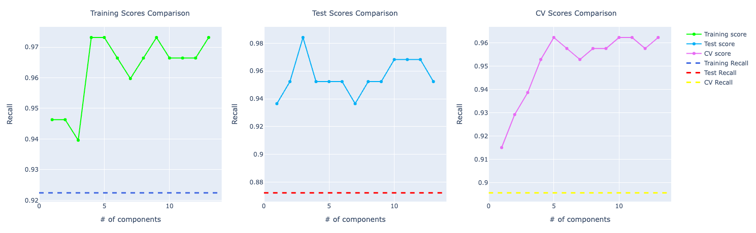
SVM
Original data set
- Training Accuracy: 90.95%
- Test Accuracy: 94.74%
- Cross validation Accuracy: 91.74%
Data set without outliers
- Training Accuracy: 93.06%
- Test Accuracy: 92.62%
- Cross validation Accuracy: 92.53%
PCA: 6 components
- Training Accuracy: 98.24%
- Test Accuracy: 97.07%
- Cross validation Accuracy: 97.18%
From taking a quickly look at these results, we notice the model trained with PCA is performing way better compared to the ones without PCA.
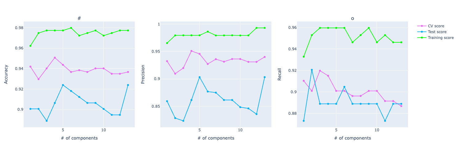
This is true for most of number of components used in PCA. But we chose 6 components for this problem:
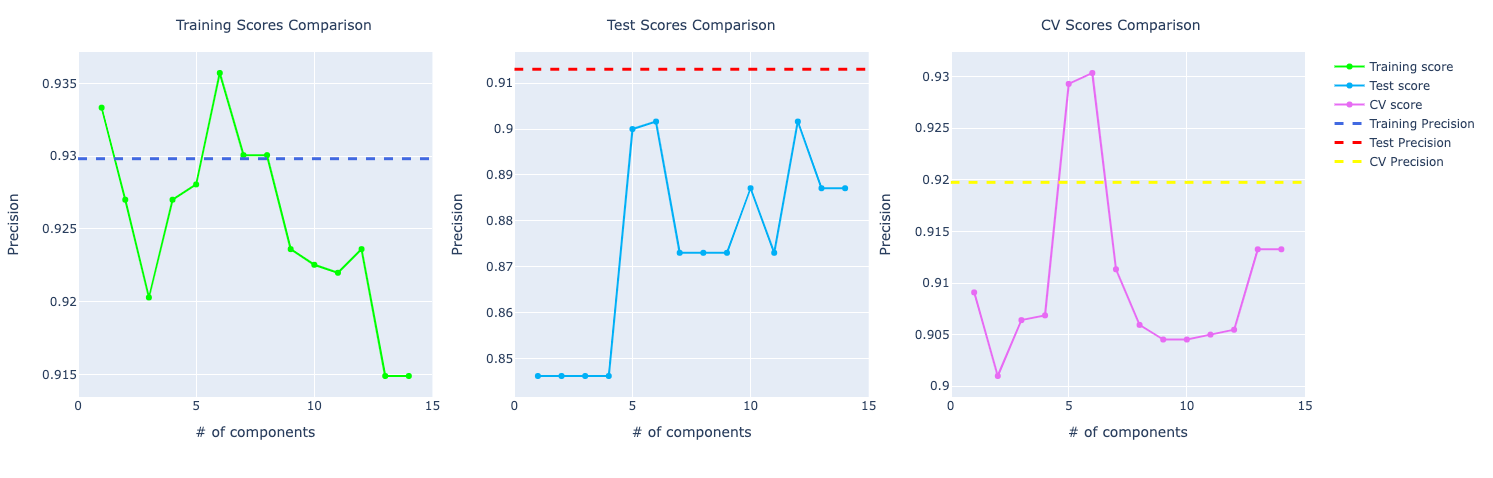
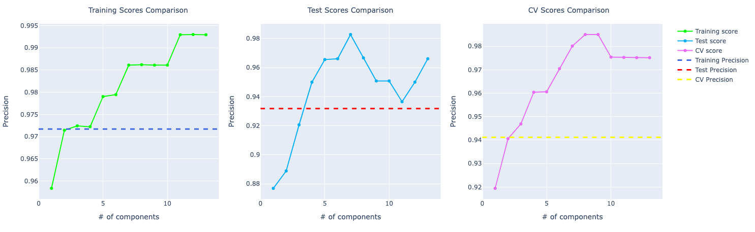
In terms of precision, they were performing very similarly but with the increase of components, the model with PCA starts to learn more about the data and perform better:
For recall, the comparison looks similar to the accuracy score. PCA performing way better than the other ones:
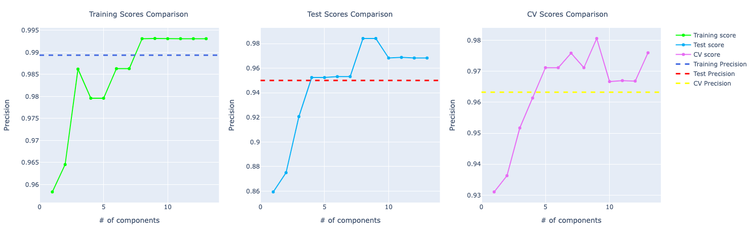
KNN
Original data set
- Training Accuracy: 94.97%
- Test Accuracy: 96.49%
- Cross validation Accuracy: 93.15%
Data set without outliers
- Training Accuracy: 95.38%
- Test Accuracy: 93.96%
- Cross validation Accuracy: 94.34%
PCA: 7 components
- Training Accuracy: 97.73%
- Test Accuracy: 95.90%
- Cross validation Accuracy: 96.66%
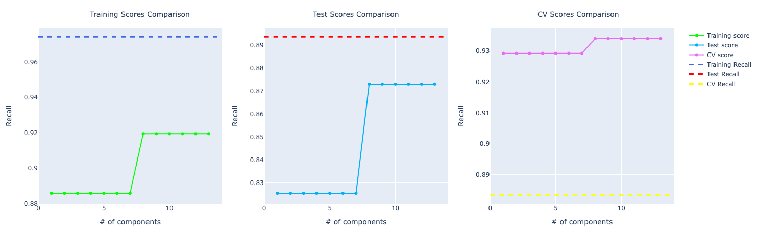
The model trained on the original data performed very well on the test data (even higher than the training score) which's a great sign. With PCA and without the outliers, both models had better training accuracy and cross-validation.
With the increase in components, the model trained with PCA starts to perform better and better. Look at the precision score compare to the model trained with the original data set:
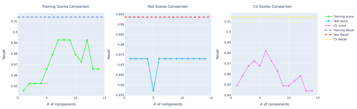
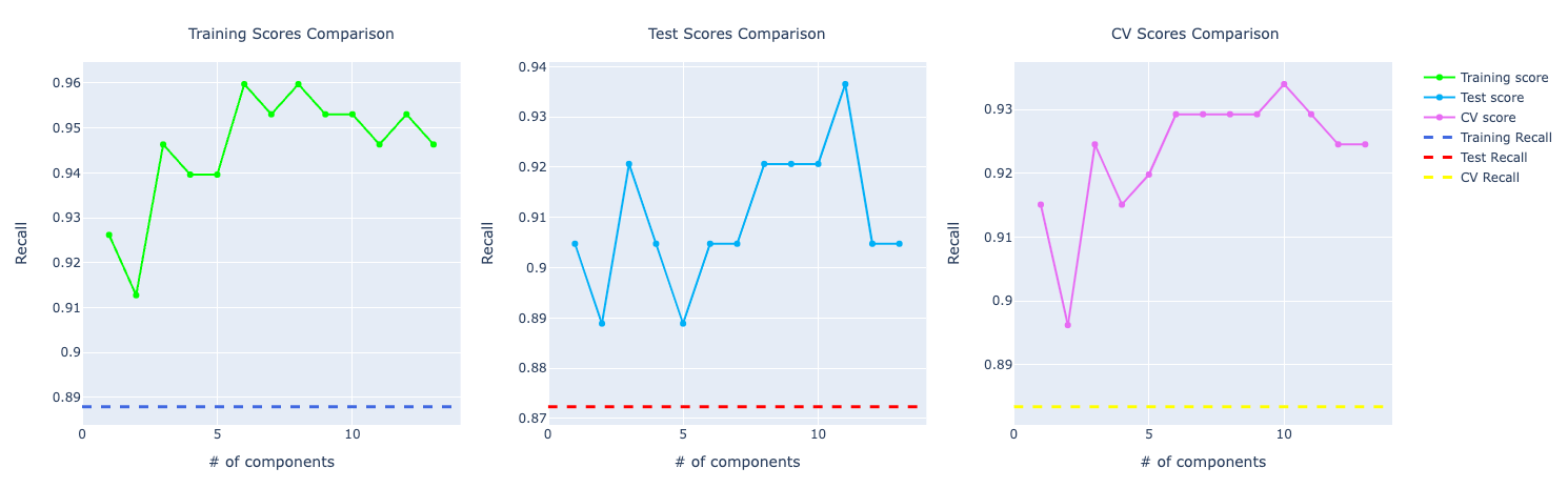
For recall, it becomes very obvious PCA is performing way better than the other models:
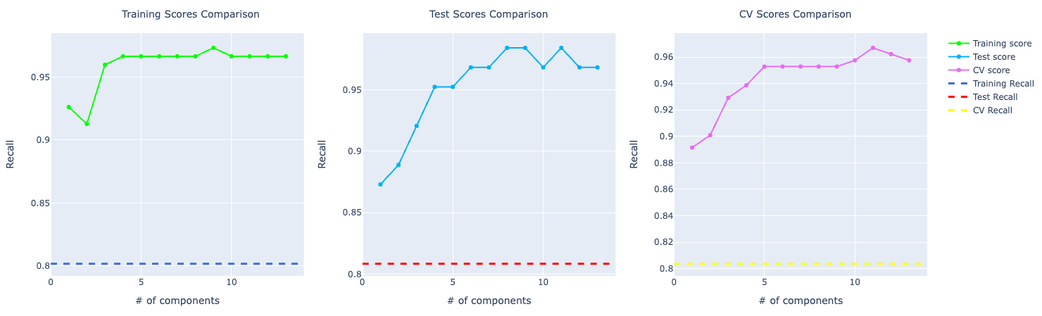
Decision Tree
Original data set
- Training Accuracy: 96.48%
- Test Accuracy: 95.32%
- Cross validation Accuracy: 93.67%
Data set without outliers
- Training Accuracy: 97.69%
- Test Accuracy: 92.62%
- Cross validation Accuracy: 94.14%
PCA: 1 component
- Training Accuracy: 95.22%
- Test Accuracy: 90.64%
- Cross validation Accuracy: 94.42%
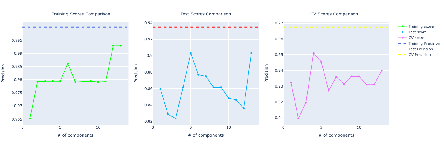
Even though the training accuracy is higher for the model trained on the data without outliers, the test accuracy is way better on the original data set. The model trained on the original data set looks less prone to a overfitting problem.
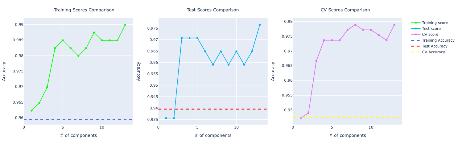
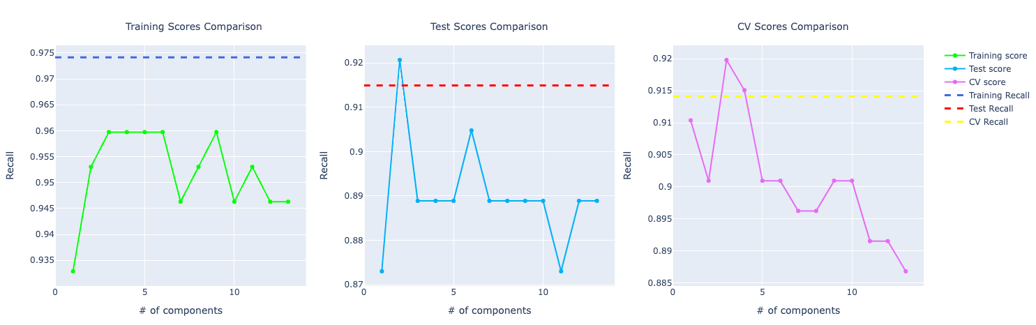
Looking at the PCA graph, we can see the distance between the score among CV, training, and test. It looks like the model is overfitting and not performing well on the test data.
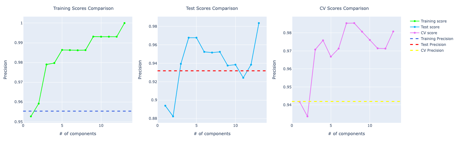
For precision, the training and test using PCA are performing better but in cross-validation, PCA metrics plummets in the graph compared to the original data.
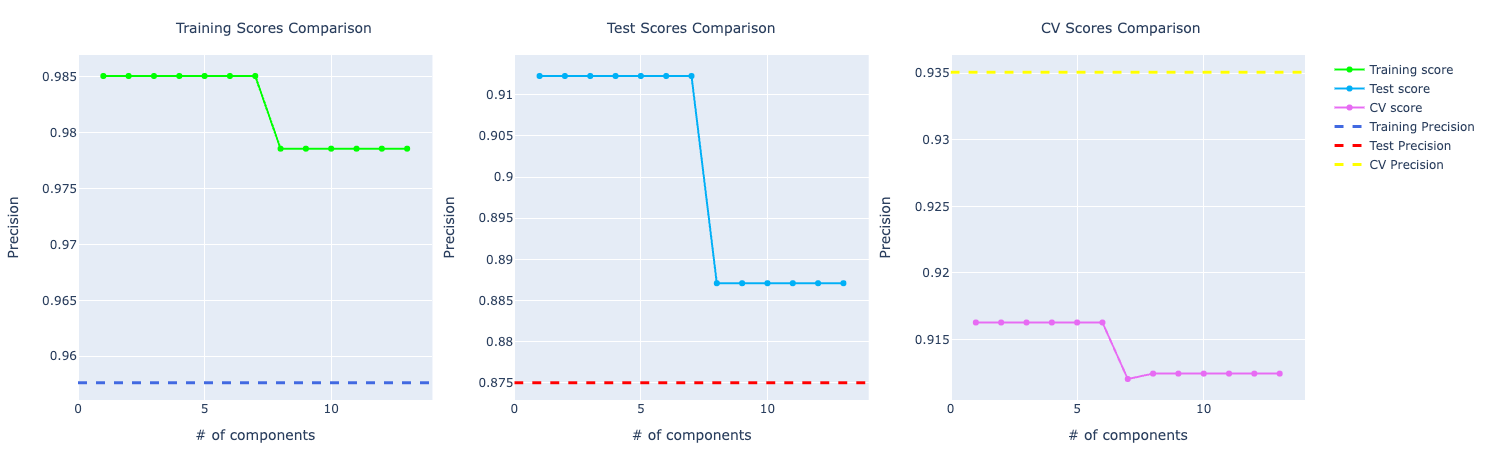
For recall, it's the other way around. The training and test are better for the original data. But in cross-validation, PCA is performing way better.
Random Forests
Original data set
- Training Accuracy: 98.99%
- Test Accuracy: 96.49%
- Cross validation Accuracy: 95.78%
Data set without outliers
- Training Accuracy: 99.13%
- Test Accuracy: 95.30%
- Cross validation Accuracy: 96.16%
PCA: 5 components
- Training Accuracy: 97.73%
- Test Accuracy: 92.39%
- Cross validation Accuracy: 94.37%
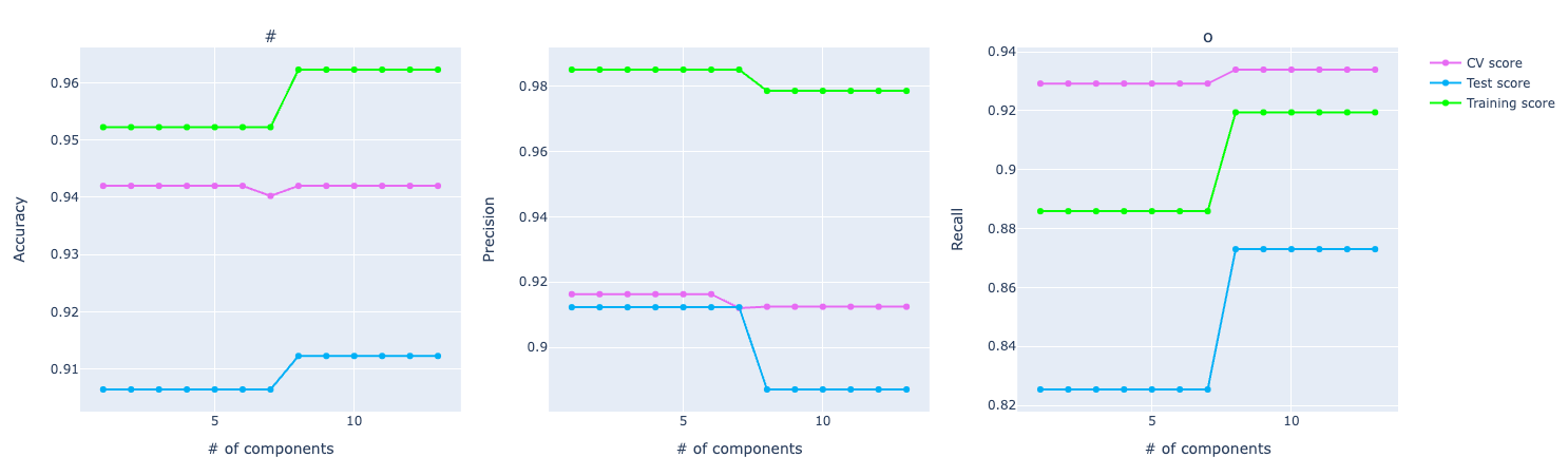
Looking at the metrics at first sight, my assumption was that the model was overfitting.
If you look at the accuracy graph, the distance among training, test, and CV looks significant.
If you look at the precision and recall scores, the assumption grows:
It really feels that the model is overfitting the training data and even though it's performing well on test and CV, it isn't that great as the training score.
XGBoost
Original data set
- Training Accuracy: 100.00%
- Test Accuracy: 96.49%
- Cross validation Accuracy: 96.66%
Data set without outliers
- Training Accuracy: 100.00%
- Test Accuracy: 93.29%
- Cross validation Accuracy: 96.57%
PCA: 10 components
- Training Accuracy: 99.49%
- Test Accuracy: 94.49%
- Cross validation Accuracy: 96.66%
The model trained using the XGBoost algorithm has similar results compared to the Random Forest one. The training scores are high and the test and CV and not following them, even though they are also high.
The models trained with the original data set and the one without outliers got training accuracy of 100% which's a big sign that the model is overfitting, especially if you see that the test and CV scores don't follow the same score.
Final Words
As I'm learning more and more about ML and statistics, I'll keep improving this project and this article. I plan to train a deep learning model for this problem and update this article in the future with the results, which will be quite interesting. Another thing I want to do is to experiment with data regularization with Lasso and Ridge and bagging for tree-based models.
I hope you could learn something new or can steal some ideas from this article. As this is the very first model I trained, there are a bunch of stuff I still need to learn and improve, but I think it was a good first project and I learned through it a lot.
Resources
- Breast Cancer Prediction repo
- Breast cancer data set
- Mathematics for Machine Learning
- Machine Learning Research